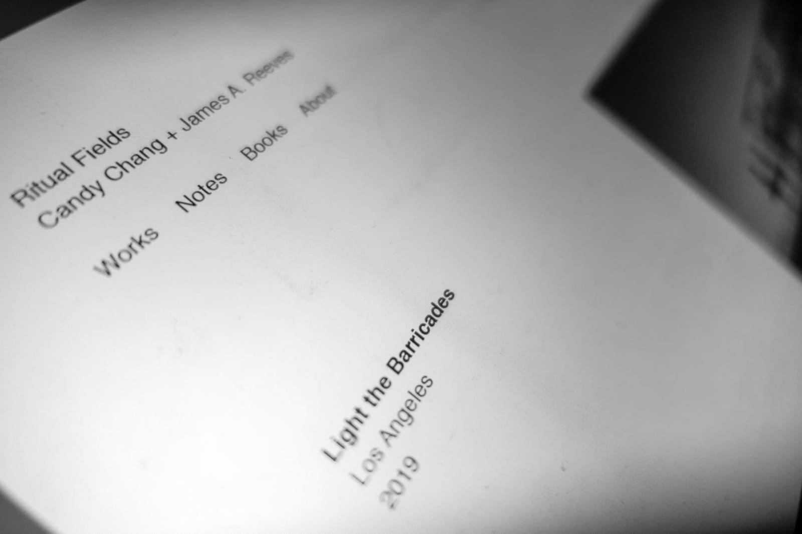
Sometimes designing a website can veer into unexpectedly existential terrain. Who am I? And what do I believe? That’s what happened today when C. and I began sketching some ideas for a new project website. The internet has become bloated and ugly, not only spiritually but in terms of code. Everything I click feels over-designed with font stacks, carousels, gargantuan banners, and wall-to-wall bullshit. So we decided to aim for something as spartan as possible. One font size. Two columns. Dead simple with white space galore.
When you cut something down to the bone, every decision becomes much more dramatic. Adding a few pixels to a margin can feel like a sudden crescendo. We spent the entire day and much of the night dithering over these decisions, and it was the most fun I’ve had in a while, bickering about whether to use regular or semi-bold.
Nowadays, reduction feels far more productive than addition.


